Ribbon Colors for a Ribbon Cutting: Red and Other Choices
- Author: Ceremonial Scissors Guide Editorial Team
- Published on
- Category: Ribbon
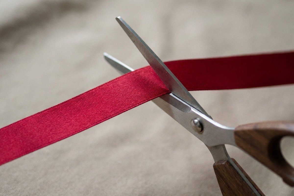
Red is a very common ribbon colour for a ribbon cutting, but it is a habit rather than a rule, and no colour is required. Choose the colour that contrasts most with the entrance and background so the ribbon reads clearly in photographs, or use a brand or team colour if it contrasts well.
Part of our guide: Ribbon for a Ribbon Cutting: Width, Length, Material and Color
Red is a very common choice for a ribbon cutting, but nothing requires it. This page is about picking a colour that works in your setting; the full set of choices for width, fabric and length is in the ribbon for a ribbon cutting guide.
Why red is common
Red contrasts with most doors, walls and greenery, and it looks festive. That is the reason this guide gives: it is a common choice, not a tradition we can document. We have not cited a primary source for any history of the colour, so we do not claim one.
Contrast with the venue and photos
Walk to the entrance and look at what will be behind the ribbon. The ribbon should be clearly lighter or darker than that background, or a different hue. A bright ribbon on a glass storefront may read well on a cloudy day but wash out in direct sun. Take a test photograph at the time of day of the event.
Brand colours and school or team colours
A brand, school or team colour is a good option when it contrasts. If the colour is dark, a two-tone ribbon with a lighter edge, or a brand-coloured bow on a light ribbon, keeps the identity while staying visible. Keep any logo or lettering off the ribbon unless you can proof it carefully.
Metallic and two-tone ribbons
Metallic ribbons catch the light, which can look lively in person but flare in photographs. Two-tone ribbons give a built-in edge against the background. Both can be firmer or slipperier than plain satin, so check them against your scissors using ribbon fabrics and the scissors that cut them.
Colour mistakes to avoid
- Matching the ribbon to the wall or door behind it.
- Choosing a colour only from a screen swatch; fabric colour varies under real light.
- Using a very dark ribbon against dark scissors.
- Adding a bow in a colour that clashes; see bows for a ribbon cutting.
When you know the colour, size the length with the ribbon length tool.
A quick way to choose
Work from the setting outwards. Stand where the audience will stand and look at the entrance, the wall and the ground. Pick two or three candidate colours, hold a fabric sample at arm’s length against the background and ask whether the ribbon is the first thing the eye finds. If more than one colour passes, choose the one that fits your brand or occasion best, then check it again in the light at the event time.
Checking with people who will see it
Photographs flatten colour, so ask someone who will be at the event, a photographer if you have one, or a colleague with different eyesight, to look at the samples. Some people find certain red and green pairings hard to separate, so avoid placing those two colours directly against each other. Do not rely on colour alone to make the ribbon visible: width and contrast in brightness help too.
Questions to ask the ribbon seller
Is the colour the same across the whole roll and across rolls ordered later? Does it fade or bleed when wet? Can you see a physical sample in daylight? A short written answer to each saves a replacement order.
What to avoid when matching other items
Do not try to match the ribbon exactly to the scissors, the bow and the signage all at once. A clear contrast between ribbon and scissors helps the cut show in a photograph, and a small difference between ribbon and bow can look like a mistake. Pick a main colour, then add one accent at most.
People also ask
What color ribbon is used for a ribbon cutting?
Red is the colour most people picture and a very common choice, but there is no required colour. Other colours are used too, including blue, orange, gold-toned and brand or team colours. Choose the one that contrasts best with the entrance, doors and surrounding signs so the ribbon is easy to see in photographs.
Does ribbon color have a meaning?
We do not assign meanings to ribbon colours. Claims about traditional meanings usually have no primary source behind them, so this guide treats colour as a practical choice about visibility and branding. If an organization wants a colour to carry a particular meaning, it can say so itself in its own materials.
Can I use my brand color?
Yes, a brand colour is a sensible choice as long as it stands out against the background. Check it against the door, wall or sign behind the ribbon. If the brand colour is dark and the background is dark, consider a lighter ribbon or a two-tone ribbon, with the brand colour as a bow or edge.
What color shows best in photos?
The colour that contrasts most with what is behind it, not one particular hue. A bright ribbon in front of a dark entrance reads well, while a red ribbon in front of a red brick wall disappears. Glossy fabrics can reflect light and look washed out, so a test photograph at the venue is worth taking.
Should the ribbon match the scissors?
It does not need to, but the pair should look deliberate together. Gold-toned or polished scissors read well against red, blue or dark ribbon, while a ribbon in a similar metallic tone can make the blades harder to see. Look at them side by side before you decide, and avoid putting the blades against a similar colour.
Further reading
Worth reading next
- Ribbon for a Ribbon Cutting: Width, Length, Material and Color
How to choose ribbon for a ribbon cutting: width, length, fabric, colour and pre-tied versus single-piece ribbons, and how to match it to your scissors.
- Bows for a Ribbon Cutting: Size, Style and Attachment
How to choose and attach a bow for a ribbon cutting: whether you need one, bow size against ribbon width, pre-made or hand-tied, and where to cut.
- Ribbon Fabrics and the Scissors That Cut Them
How satin, grosgrain, organza, velvet, wired and paper ribbon behave under ceremonial scissors: fray, stretch and slip, and how to test before the day.